01
People think about destinations.
Commuters were more likely to describe where they were going than remember a route number.
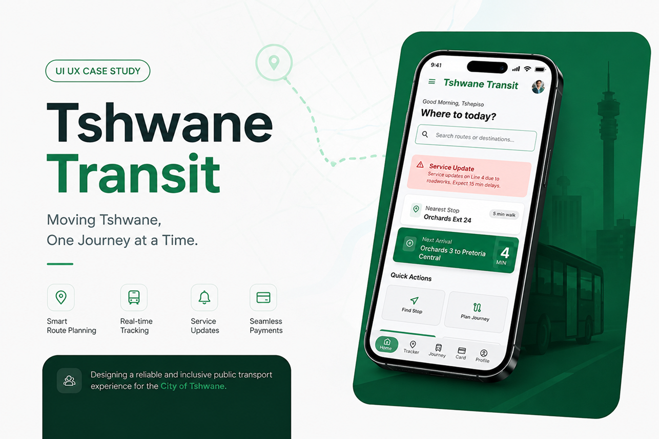
Moving Tshwane, one journey at a time. A concept transit service designed to help commuters plan journeys, track buses and navigate transfers with greater confidence.
A commuter-focused transit concept informed by commuter research and prototype testing. The final experience prioritises destination-based journey planning, live tracking and clearer transfer guidance, with testing used to identify and refine usability issues before the final prototype.
Tshwane Bus Services is the most affordable option for many daily commuters in Tshwane. But affordability alone does not make a transport service dependable.
I wanted to understand what happens when commuters do not have enough information to know whether a bus is coming, delayed or already gone.
I spent a week using Tshwane buses and speaking directly with commuters during their journeys. I looked at how people plan trips, find stops, handle delays and navigate transfers.
The result was Tshwane Transit, a concept digital service that brings journey planning, live bus tracking, transfer guidance and service alerts into one experience.
A commuter may know the route they want, but still have little visibility into what is happening while they wait. When information is limited, people make decisions based on assumptions, past experience or what other passengers tell them.
This becomes more difficult for first-time and older passengers who have less familiarity with the network. Transfers create another point of uncertainty because passengers need to understand where to get off, where to walk and which bus to take next.
I used a mixed-method research approach to understand how commuters navigate Tshwane's bus network, where uncertainty enters the journey and what information would help people make better travel decisions.
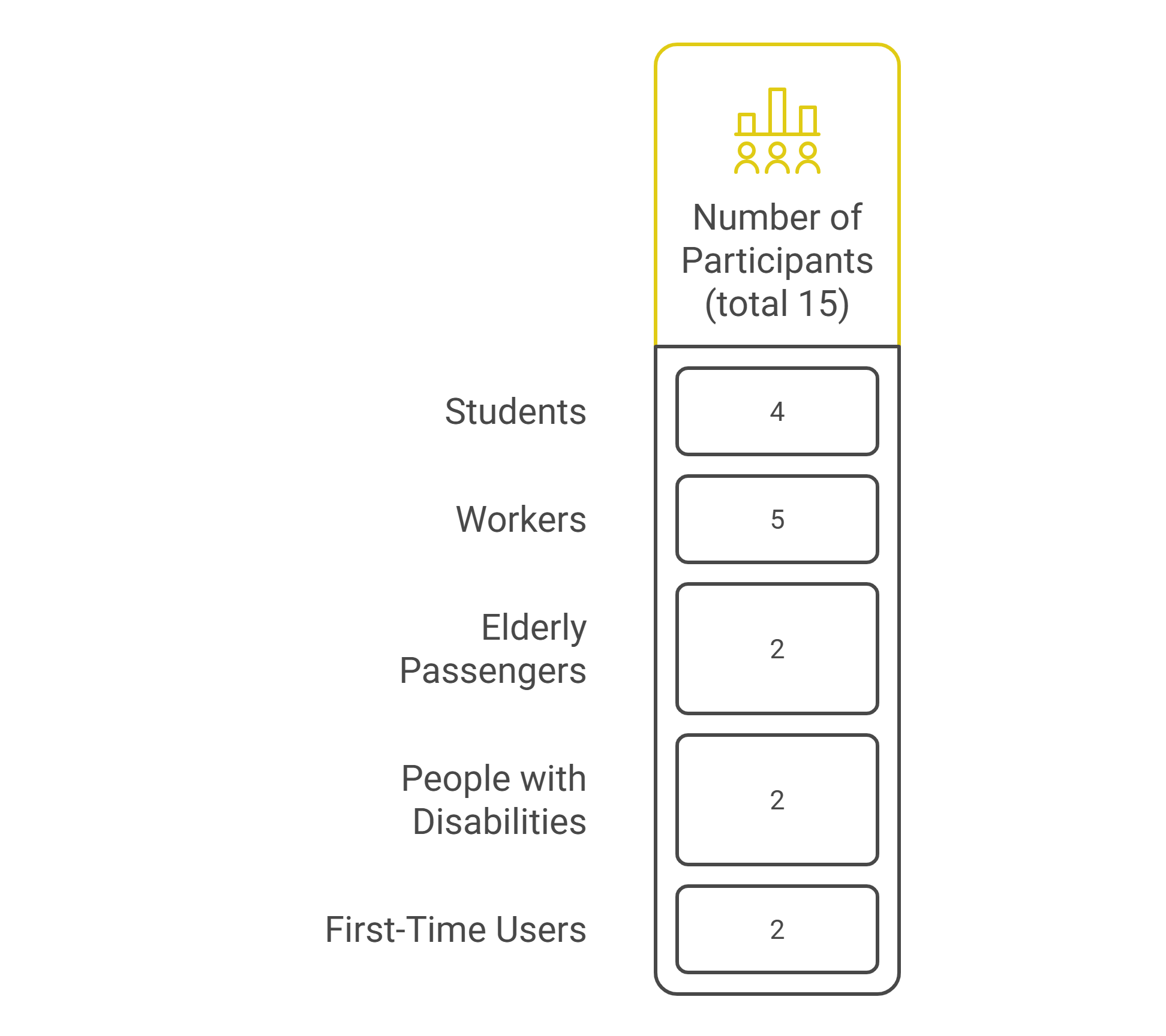
Participant recruitment was conducted directly in the Tshwane bus network. I spent one week travelling on the buses and approached commuters during their journeys to invite them to participate in the research.
Recruiting people in the service environment allowed me to speak with passengers who were actively using the transport network rather than relying only on online recruitment.
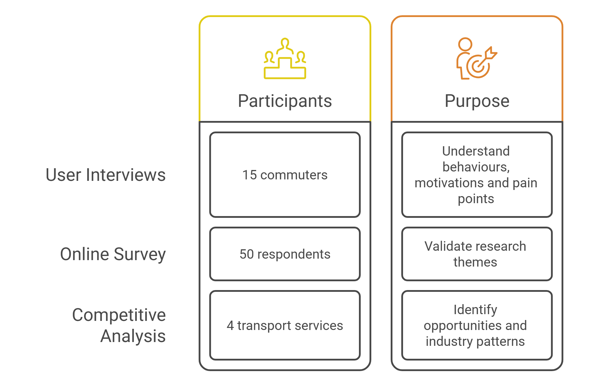
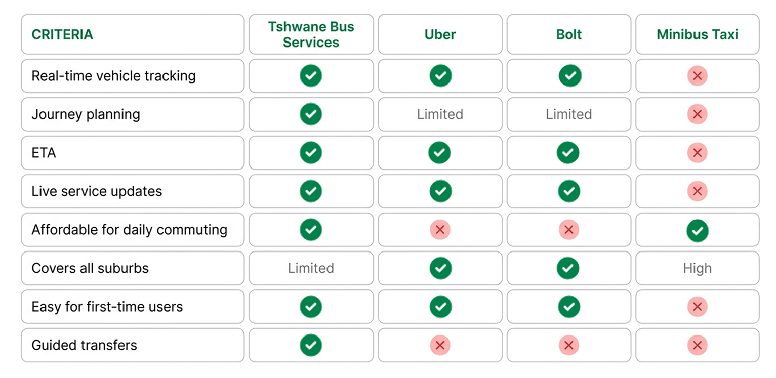
I reviewed four transport services to understand how people already experience journey planning, live location information, arrival estimates, transfers and service disruptions.
The comparison helped identify expectations that a Tshwane transit experience would need to meet while highlighting opportunities specific to the bus network.
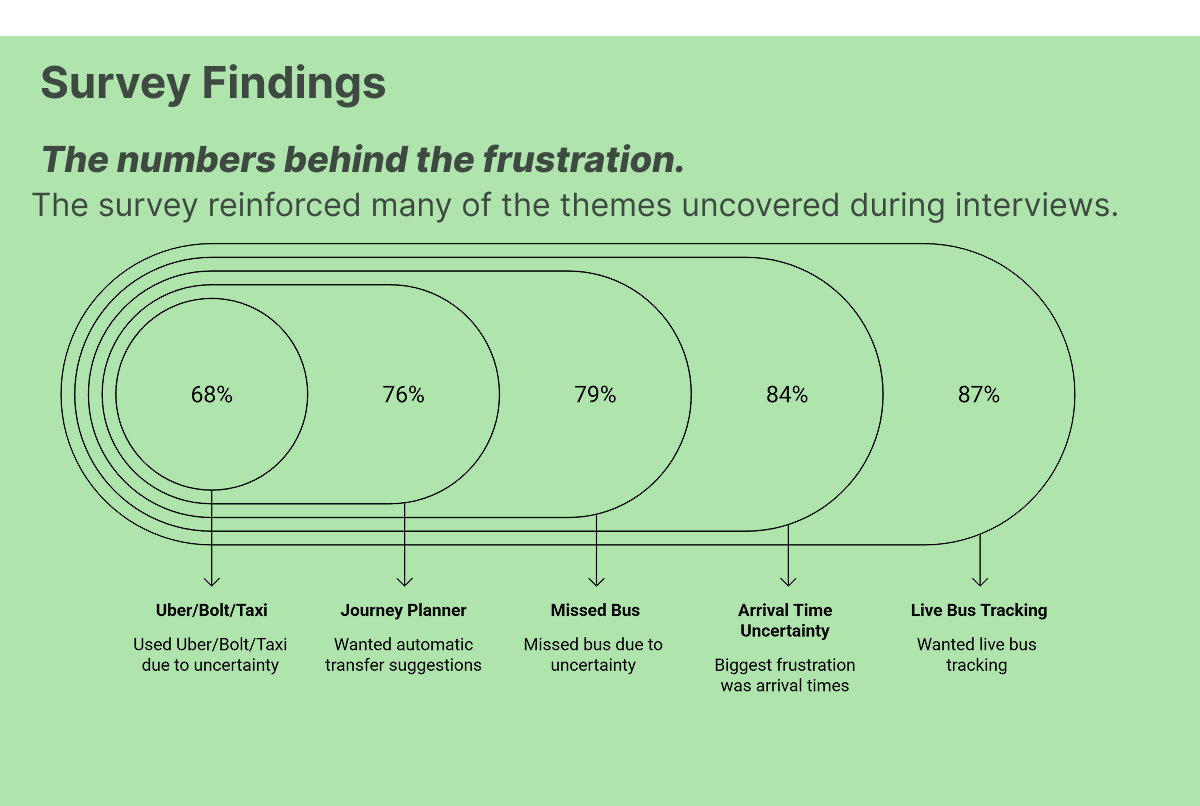
The survey helped test whether the issues identified during interviews appeared across a wider group of commuters.
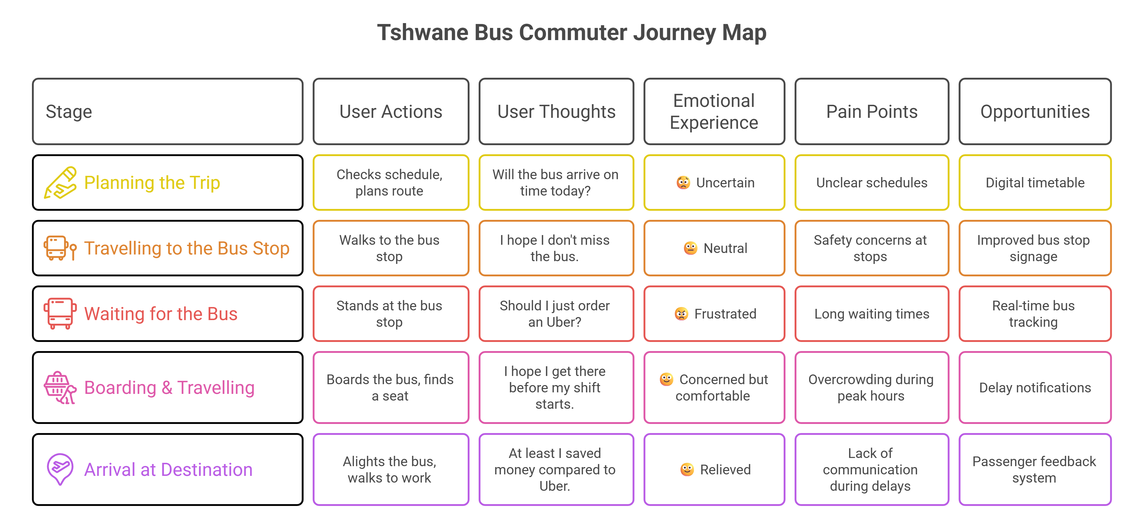
I mapped the commuter journey to identify where people experienced uncertainty, frustration or needed additional support.
The exercise highlighted waiting and transfers as important moments where better information could change the experience.
Commuters were more likely to describe where they were going than remember a route number.
Uncertainty around arrival made the waiting experience more stressful and harder to plan around.
Passengers needed more support when changing buses, especially when travelling through unfamiliar areas.
Commuters already use digital services to understand movement around the city, creating a familiar standard for speed and clarity.
First-time and older passengers needed clearer directions to stops and through transfers.
“I never know if the bus is coming until it's late.”Participant interview - Tshwane bus network
I created personas from the research to represent the different needs, behaviours and levels of familiarity within the commuter experience.
These personas helped me evaluate whether the proposed experience worked for more than a typical daily commuter.
.jpg)
.jpg)
Live bus locations, arrival estimates and service alerts allow passengers to make decisions before committing to a wait.
Destination-based search matches the way commuters naturally describe their journeys.
The experience explains where to get off, where to walk and which bus to take next.
Journey planning, tracking, alerts and Connector Card information are brought into one service.
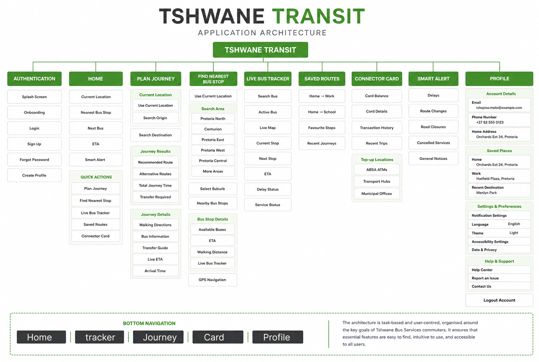
I structured the experience around what commuters were trying to accomplish rather than the structure of the transport network itself.
This made destination search, journey planning and live tracking central parts of the navigation.
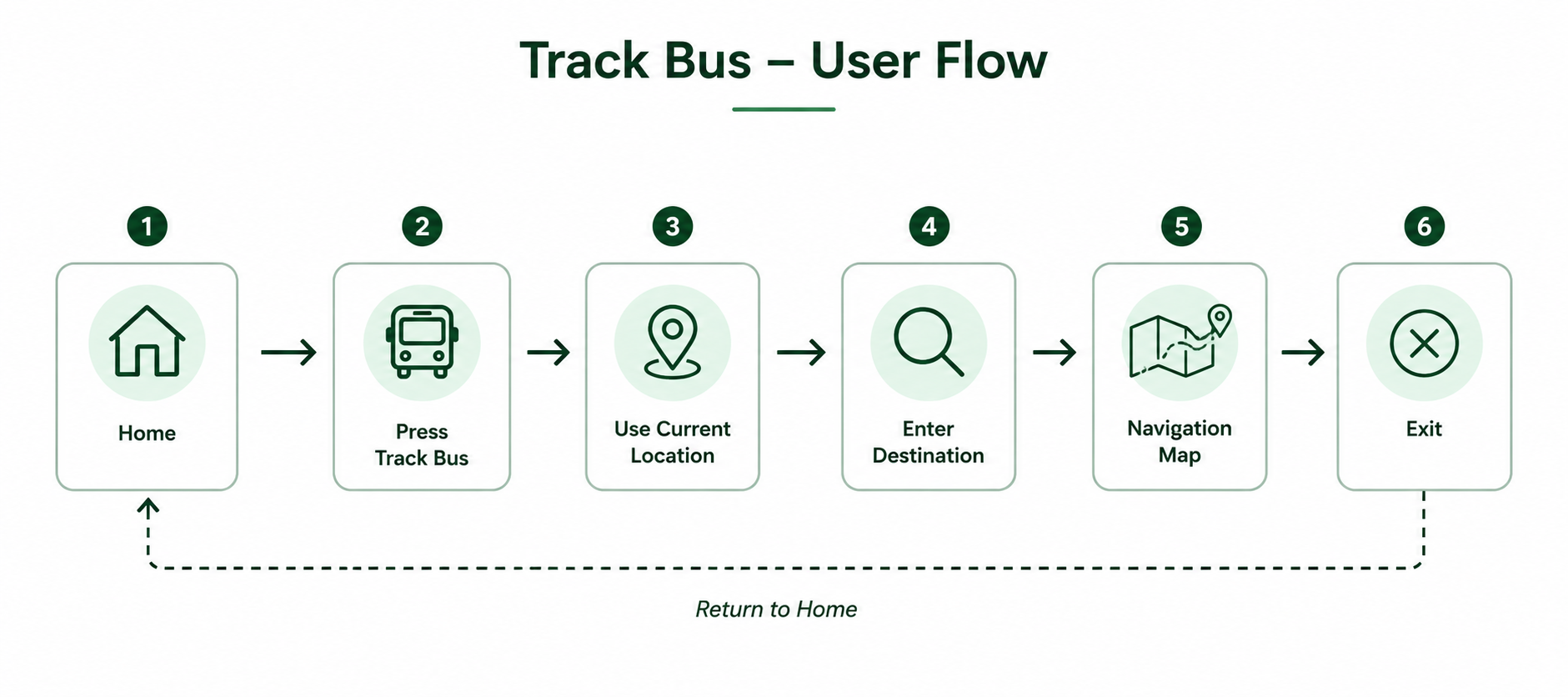
The main design challenge was deciding what information commuters needed at each point in their journey.
Rather than presenting every available piece of transport information at once, the interface prioritises the next decision a passenger needs to make.
The final screens below show how those decisions translated into the product.
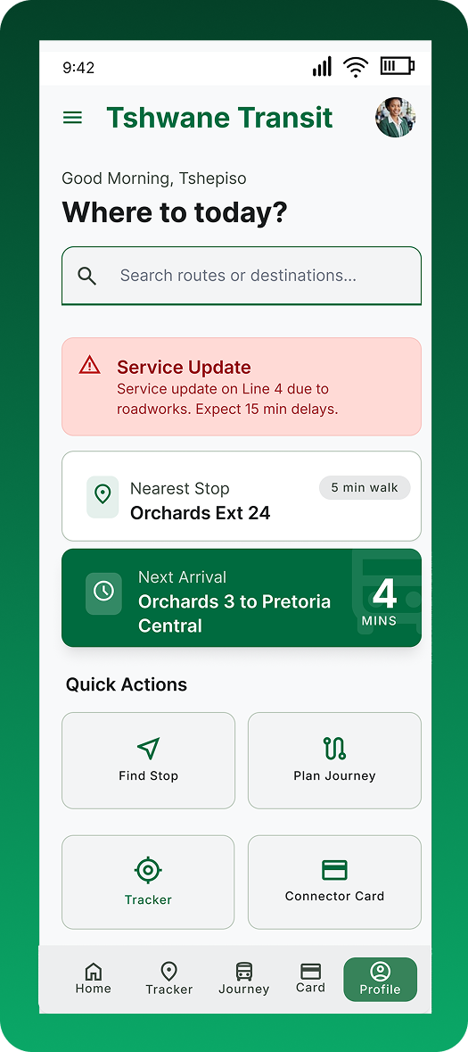
The home screen gives commuters direct access to the actions they are most likely to need, including journey planning, bus tracking and finding a nearby stop.
Testing showed that participants needed a clearer starting point, so the primary actions were given stronger visibility.
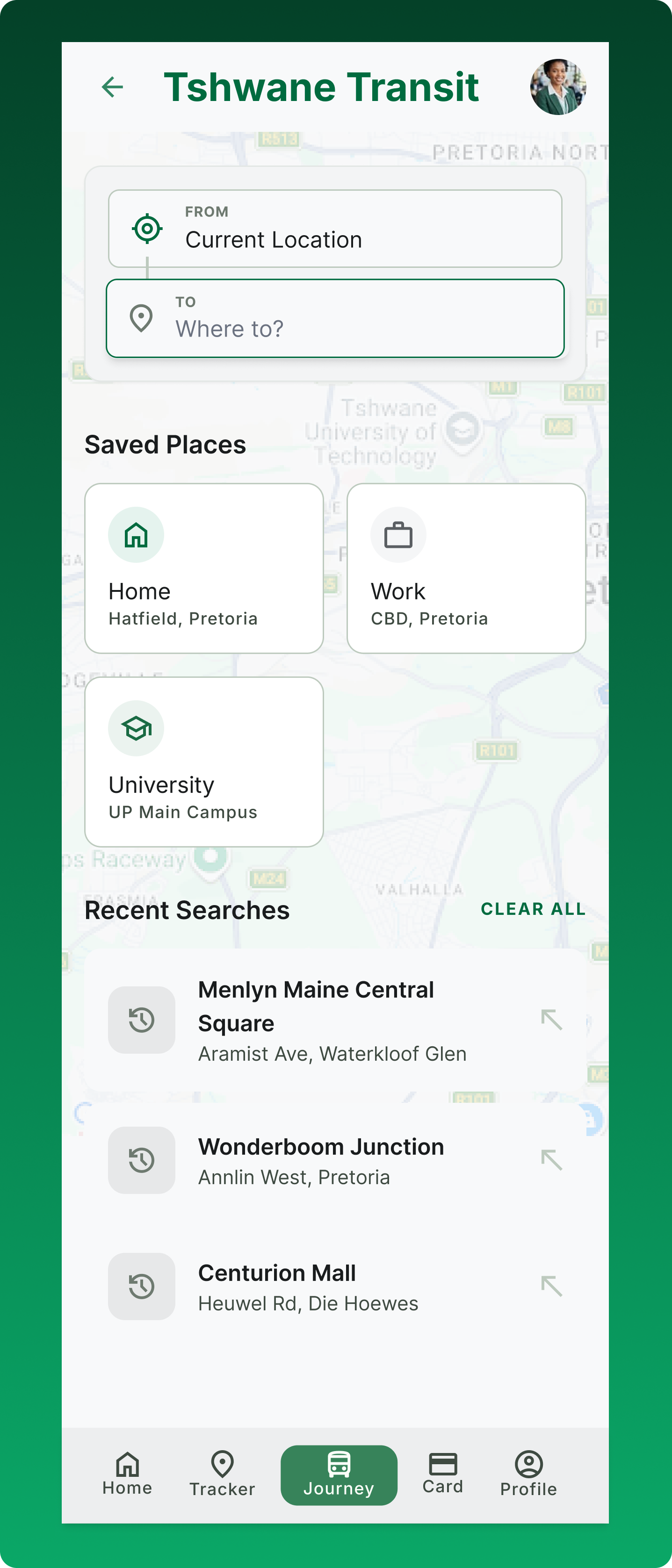
The planner starts with where the commuter wants to go. Available journeys show travel time, walking distance and transfers before the route is selected.
This directly responds to the research finding that commuters naturally think about destinations rather than route numbers.
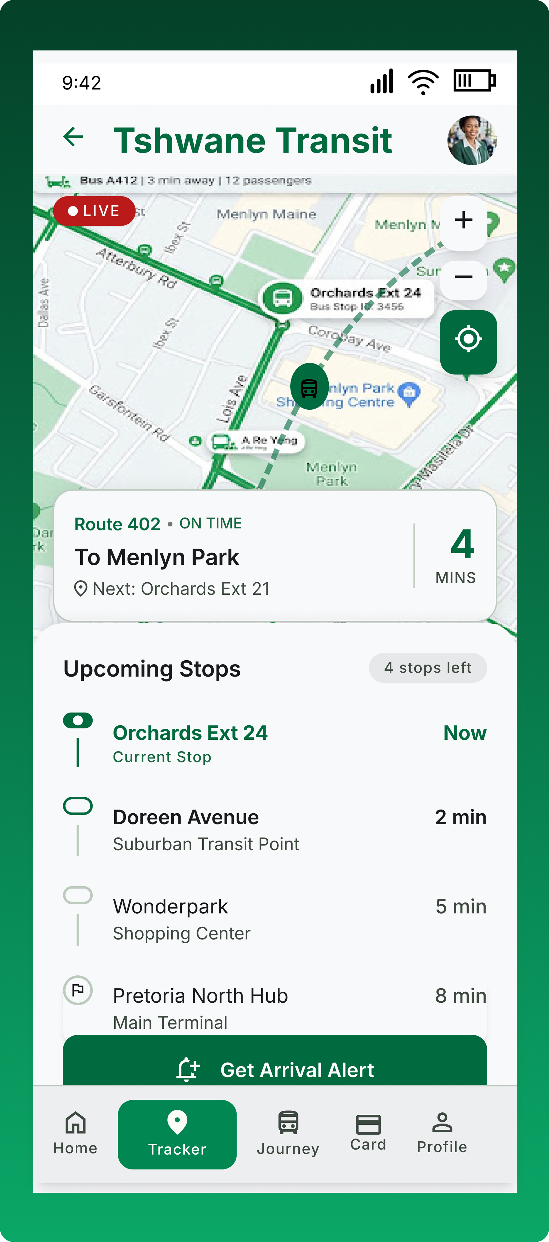
Live bus information gives commuters a clearer picture of what is happening while they wait. The interface combines vehicle location, ETA and route information in one view.
The goal is not simply to show a moving bus on a map, but to help answer the decision behind the wait: should I keep waiting?
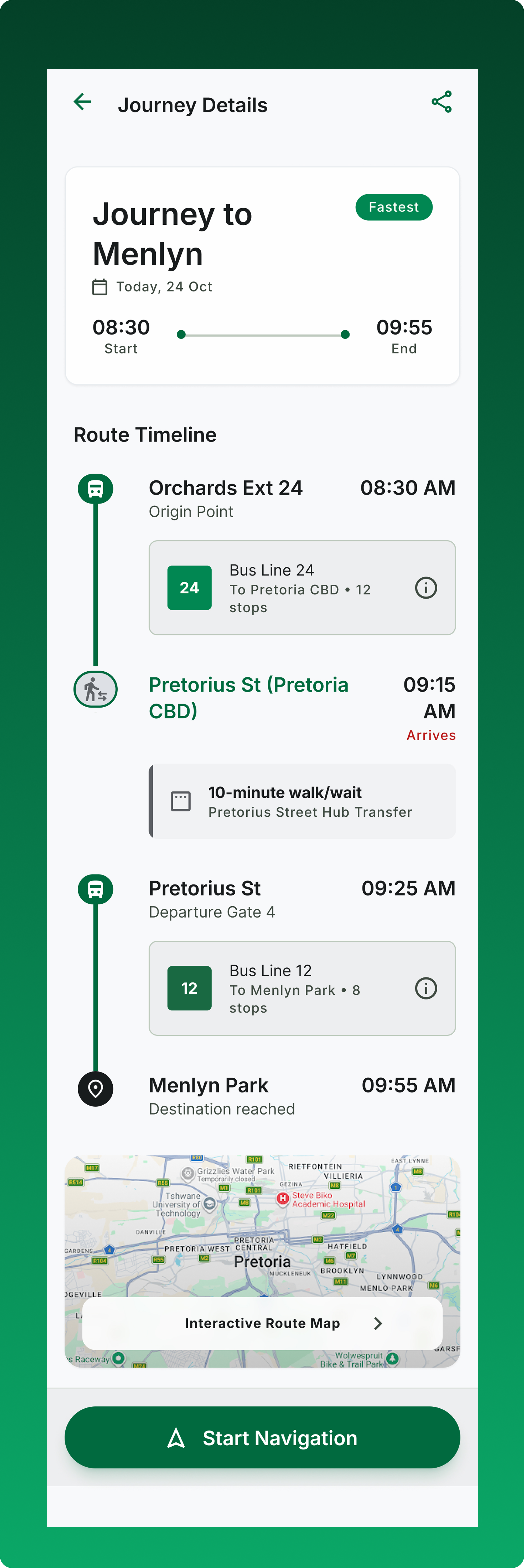
The journey timeline breaks the trip into clear stages, showing walking directions, boarding points, travel segments and transfers.
Transfer uncertainty was one of the clearest opportunities from the research, so the journey was turned into a sequence passengers could follow step by step.
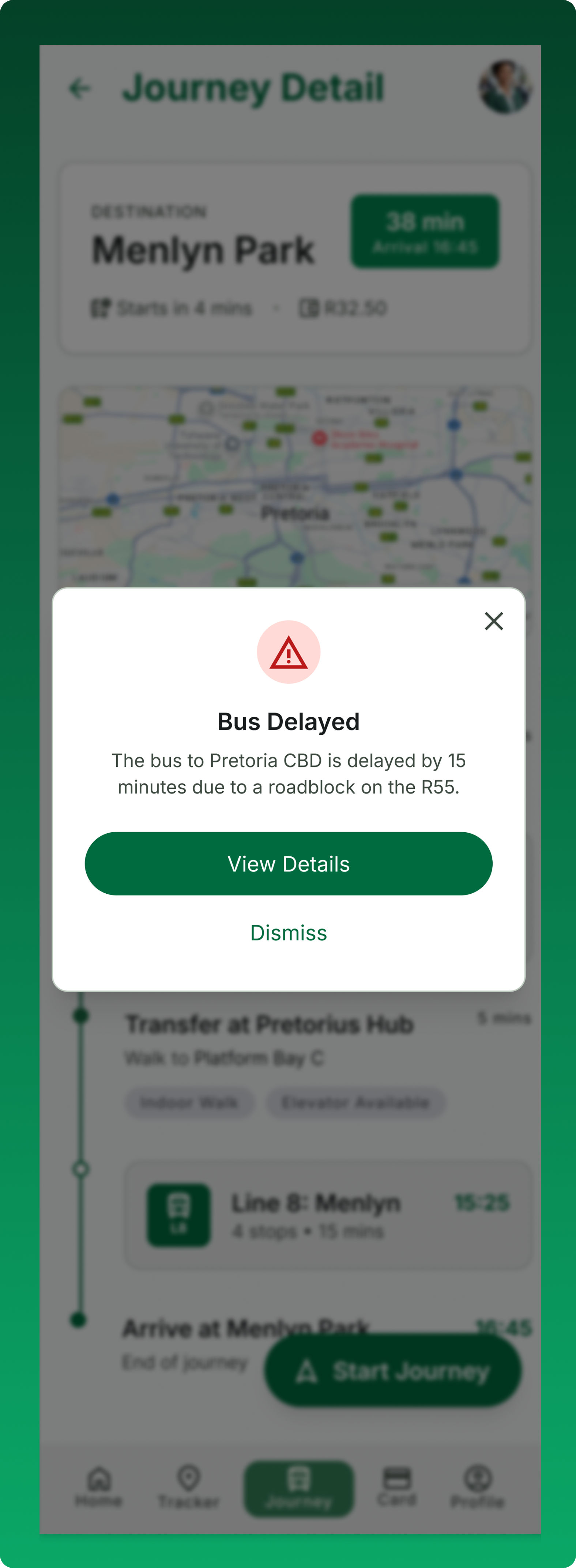
Service alerts provide commuters with clear, actionable information about disruptions affecting their journey. They show where the delay is happening, what is causing it, and how long the bus is expected to be delayed
An alert is useful when it helps someone decide what to do next, not simply when it tells them that something has gone wrong.
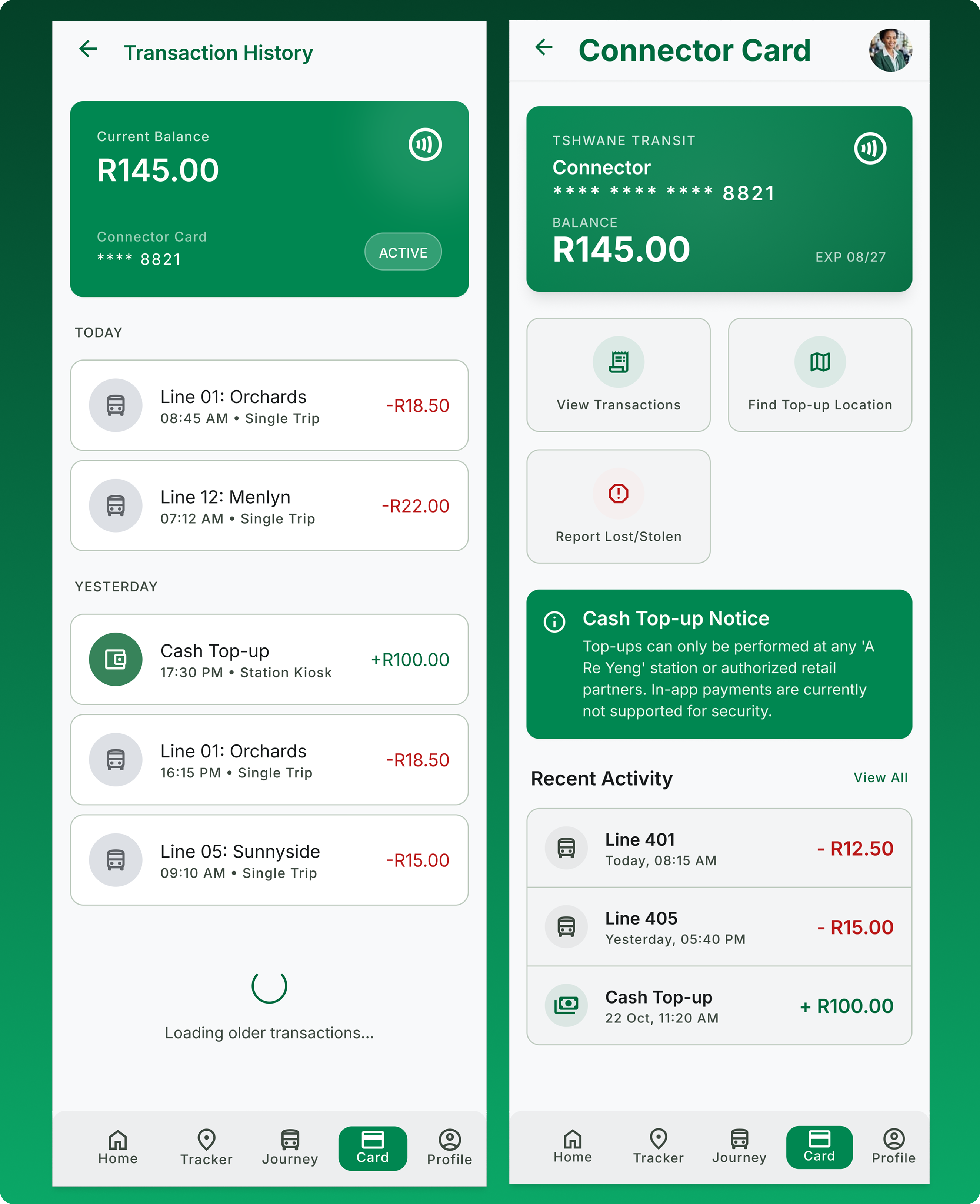
The Connector Card section gives passengers a central place to view their card information and manage their transport account.
This extends the product beyond journey planning into the practical needs of using the transport service.
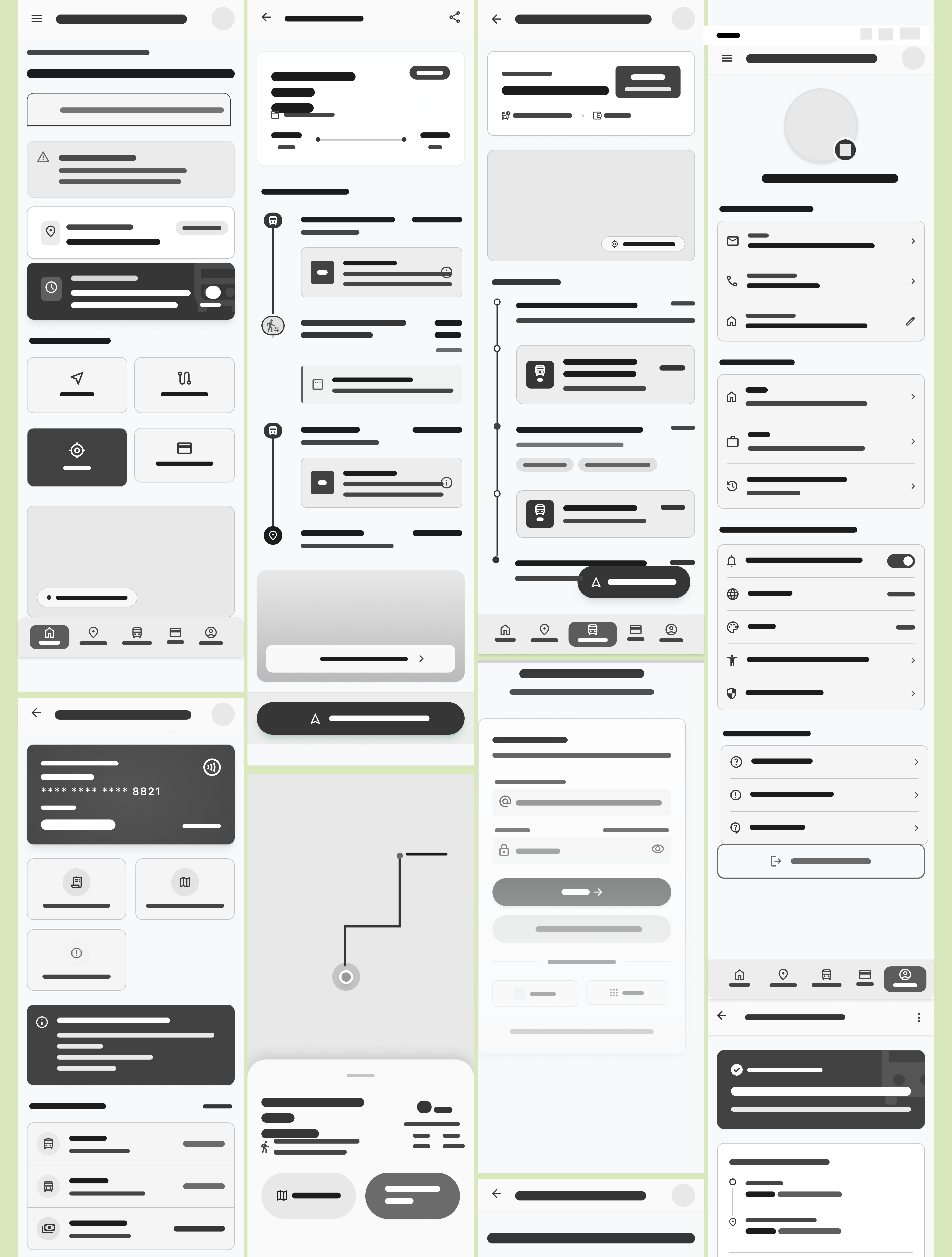
Before moving into high-fidelity UI, I used low-fidelity layouts to test hierarchy, content priority and task flow. This helped identify where the experience needed to change before visual polish was introduced.
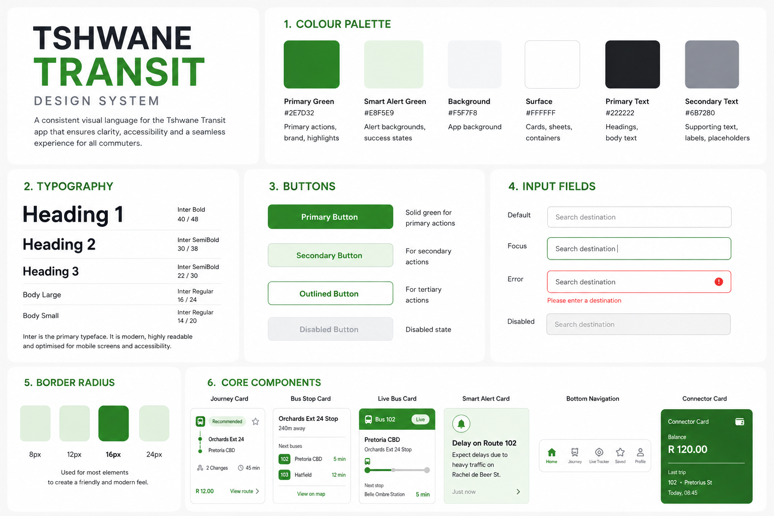
The visual system uses deep green as the primary colour, supported by near-black text, white space and clear hierarchy.
Inter was selected for its readability across mobile interfaces. Reusable components were created for bus information, ETA cards, route timelines, map markers, alerts, search and navigation.
The goal was to make the interface predictable. Once a commuter understands one pattern, they should be able to recognise it throughout the app.
A transit experience cannot provide accurate information unless the systems behind it can support that information. I mapped the main product features to the operational and technical requirements they would depend on.
Live tracking would depend on reliable vehicle location data. Journey planning would require route and transfer data. Connector Card functionality would require integration with fare management systems.
This shifted the project from thinking only about screens to thinking about the service that makes those screens trustworthy.
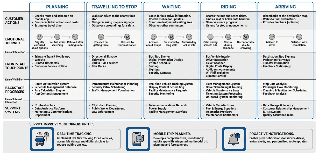
This project was designed as a concept, so I did not have access to live fleet GPS, production route data or fare-management APIs. Rather than present these systems as if they already existed, I treated them as dependencies and designed the experience around what would need to be available for the product to work in production.
I tested the prototype across five core tasks: finding a nearby bus, planning a cross-city journey, tracking an approaching bus, checking Connector Card balance and responding to a delay. The sessions helped identify where the experience needed clearer navigation and guidance.
Participants needed a more obvious way to begin. The final home screen gives the most important actions direct visibility.
Transfer information became easier to follow through the visual journey timeline.
Older participants found a map alone difficult to follow, so the final experience combines map information with step-by-step directions.
Tshwane Transit is a concept, so I have not measured real-world behavioural change. Instead, I defined the outcomes and metrics I would use if the service moved into production.
Passengers can make decisions using current bus information, follow unfamiliar journeys with more confidence and respond to disruptions before spending unnecessary time waiting.
A digital service could provide a clearer communication channel for disruptions and create opportunities to understand where passengers experience delays and transfer problems.
The next stage would be validating the concept with a larger and more diverse group of commuters during real journeys, followed by testing the service against the operational systems required to support live information.
This project changed how I think about transit design. The interface is only one part of the experience. A live tracker is useful only when the underlying data is accurate. A journey planner depends on reliable routes and transfers. An alert needs to reach a passenger early enough to change what they do.
The research also changed how I think about information. Commuters did not need more information. They needed the information that helped them make their next decision.
That became the principle behind the final experience: give commuters enough information to confidently decide what to do next.