Information fragmentation
Case details lived across files, messages and folders instead of one record a worker could trust.
UX case study · 2026
A speculative product design project exploring how case management could better support frontline workers. I studied how information moves through a case, identified points of friction, and redesigned the workflow around how information actually unfolds instead of how a static form assumes it should.
Caseworkers were working across paper notes, Word documents, spreadsheets, WhatsApp, email and shared folders. Having several tools wasn't the real issue. The same piece of information was being captured, stored and retrieved in different places, and nothing kept those copies in sync.
Case details lived across files, messages and folders instead of one record a worker could trust.
The same information got typed more than once: when a case changed, and again when a report was due.
Every report meant hunting for information, reformatting it, then compiling it by hand.
How might we help caseworkers capture, find and update sensitive case information without adding work to already high-pressure interactions?
I needed to understand where information could become duplicated, difficult to retrieve or unnecessarily time-consuming, and which parts of the workflow created the most friction for frontline staff and the coordinators supporting them.
| Method | Participants | Focus | How it shaped the design |
|---|---|---|---|
| Contextual inquiry | 5 frontline caseworkers | Watched how cases were handled and recorded in context. | Surfaced repeated work, tool switching and intake friction. |
| Structured interviews | 3 regional operations leads | Explored how reporting, coordination and case visibility work. | Defined the visibility and reporting needs the system needed to support. |
Where does information get duplicated?
What's actually needed at first contact?
Where do people lose time searching or compiling?
What does a coordinator need to see across cases?
I traced a typical caseworker journey from intake through reporting and follow-up. The map helped separate what looked like an interface problem from what was actually a workflow problem.
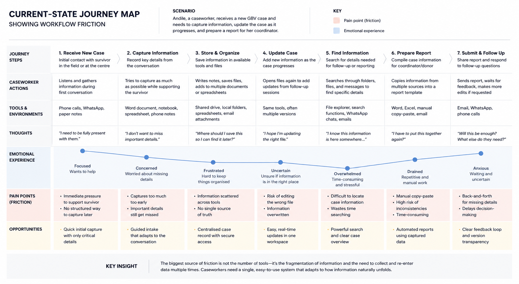
The number of tools wasn't the real problem. Information moved between them with no consistent structure, so caseworkers had to remember where each piece lived, re-enter it, then verify it again later.
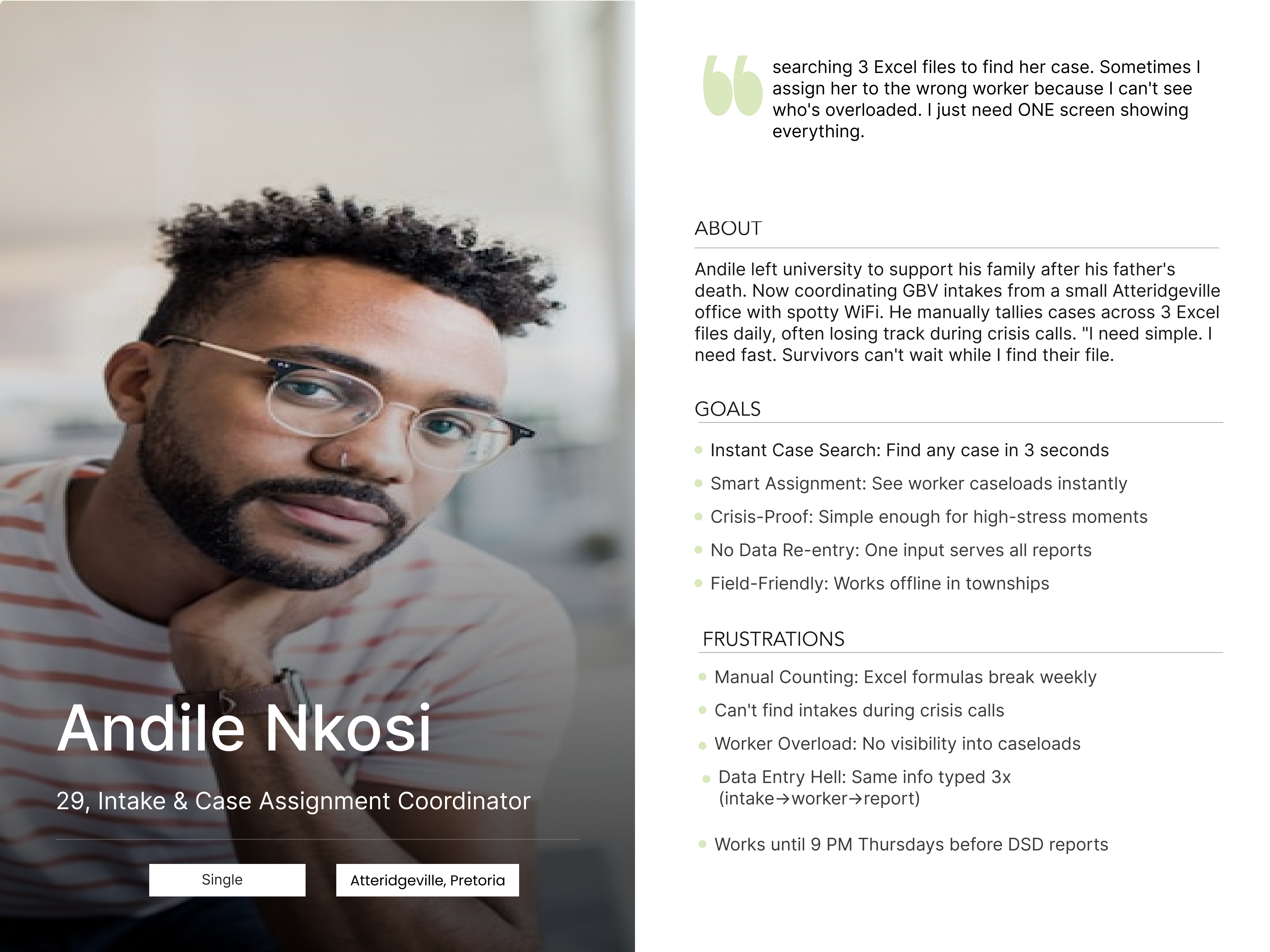
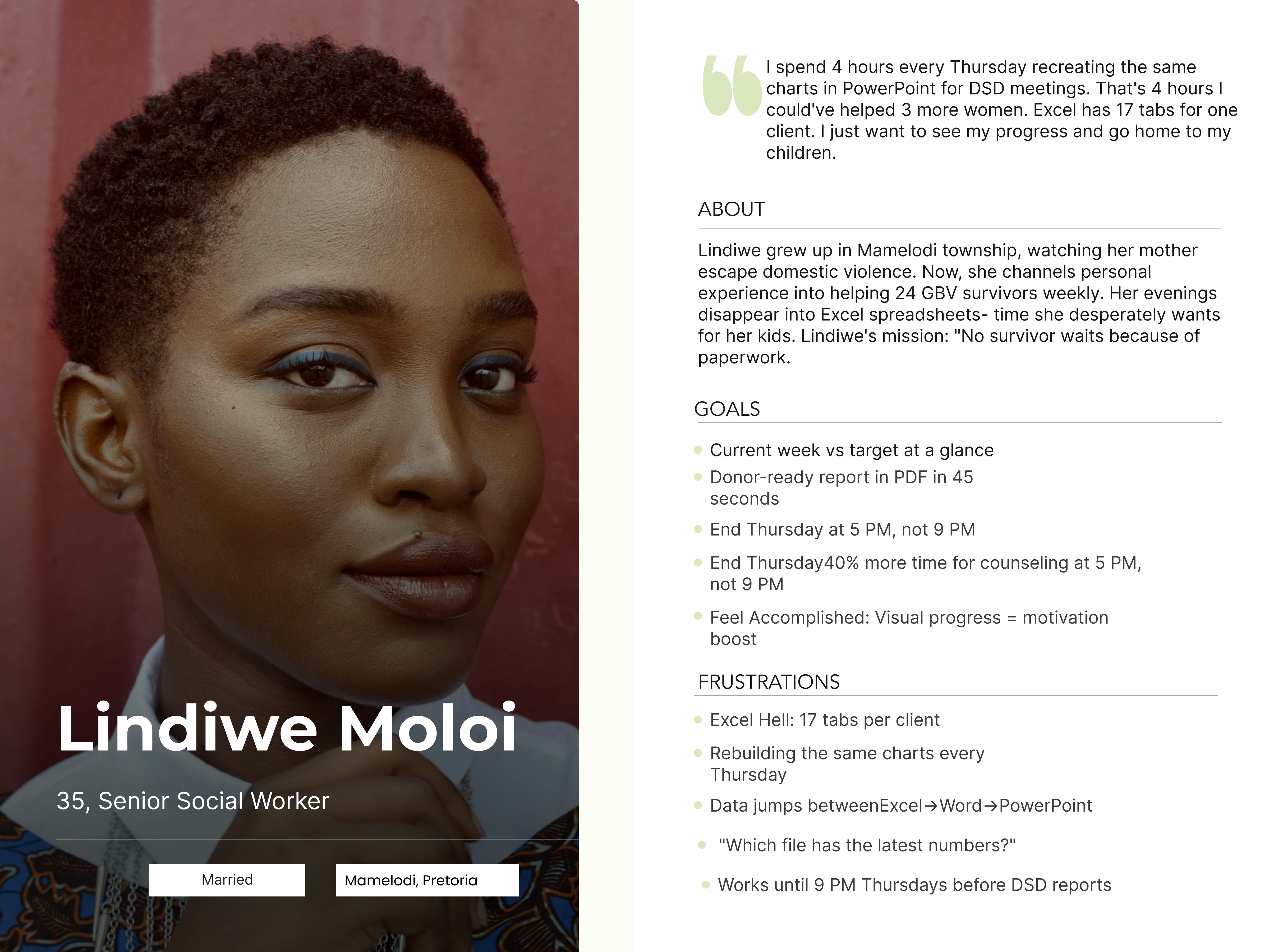
Frontline staff needed a fast, forgiving way to capture case information in the moment. Regional coordinators needed visibility across many cases and a faster path to reporting. The design had to hold both.
Capture information when it becomes available, not all at once.
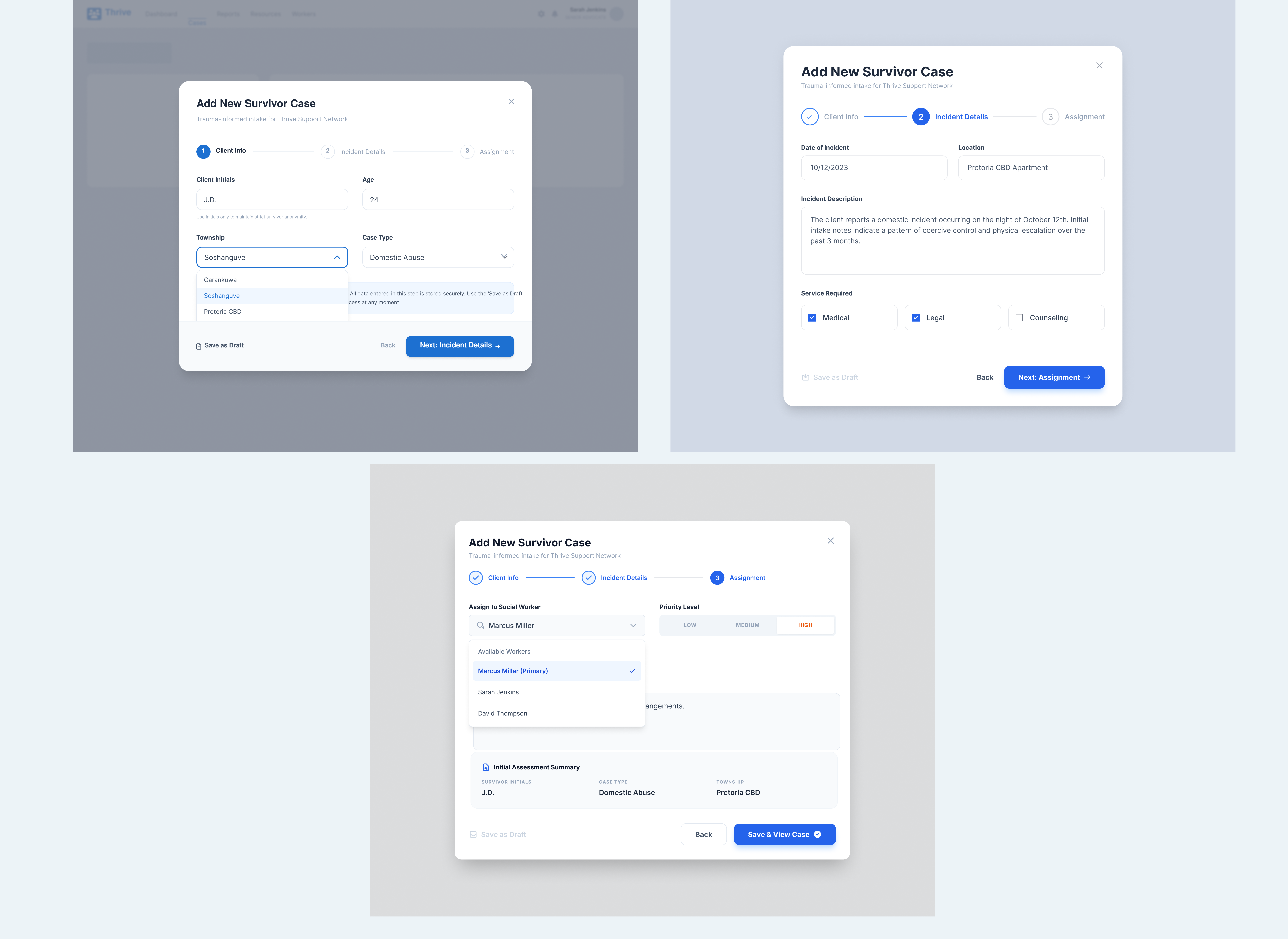
That became the design's central rule. Instead of digitising the existing paperwork, I rebuilt the workflow around how information actually unfolds during casework: in pieces, over multiple conversations, not in a single sitting.
My first high-fidelity version had 18 fields, asking for demographic, geographic, historical and legal information upfront. Testing made the flaw obvious: that much information usually isn't available on day one, so the form was asking for things a worker couldn't yet provide.
Full case information was required during the first interaction.
22 min Prototype task timeSafety and basic identification first. Everything else follows once it's known.
6 min Prototype task timeThe revised flow keeps first contact focused while letting the case record grow as the relationship develops. It cuts the initial burden without dropping information the workflow may need later.
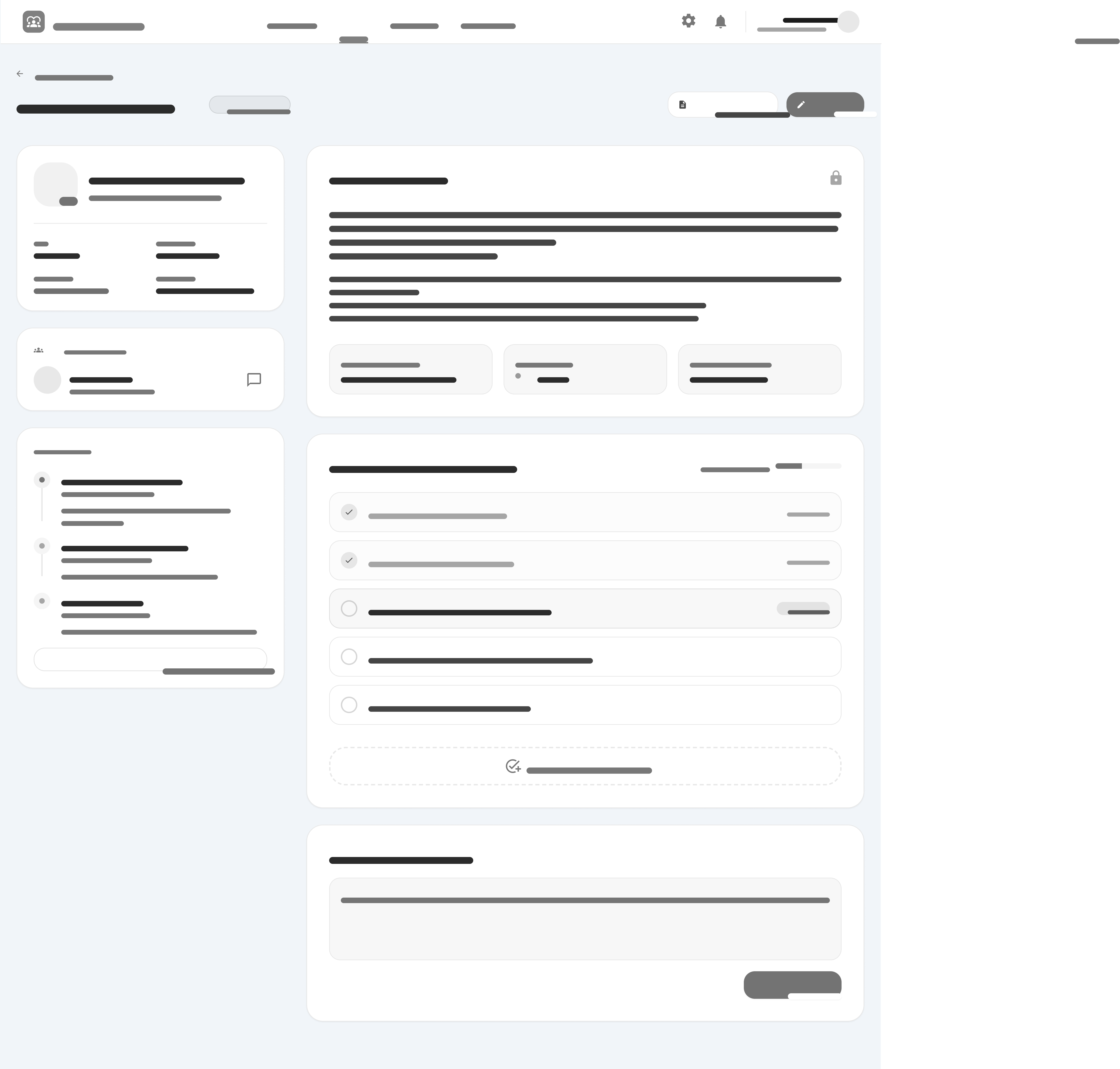
Wireframes let me test information hierarchy and navigation without visual styling getting in the way. That process also exposed actions that were buried too deeply to be useful.
The early concept tucked filtering into an expandable panel. Testing showed workers reached for those controls frequently while locating active cases, so the final layout keeps them visible.
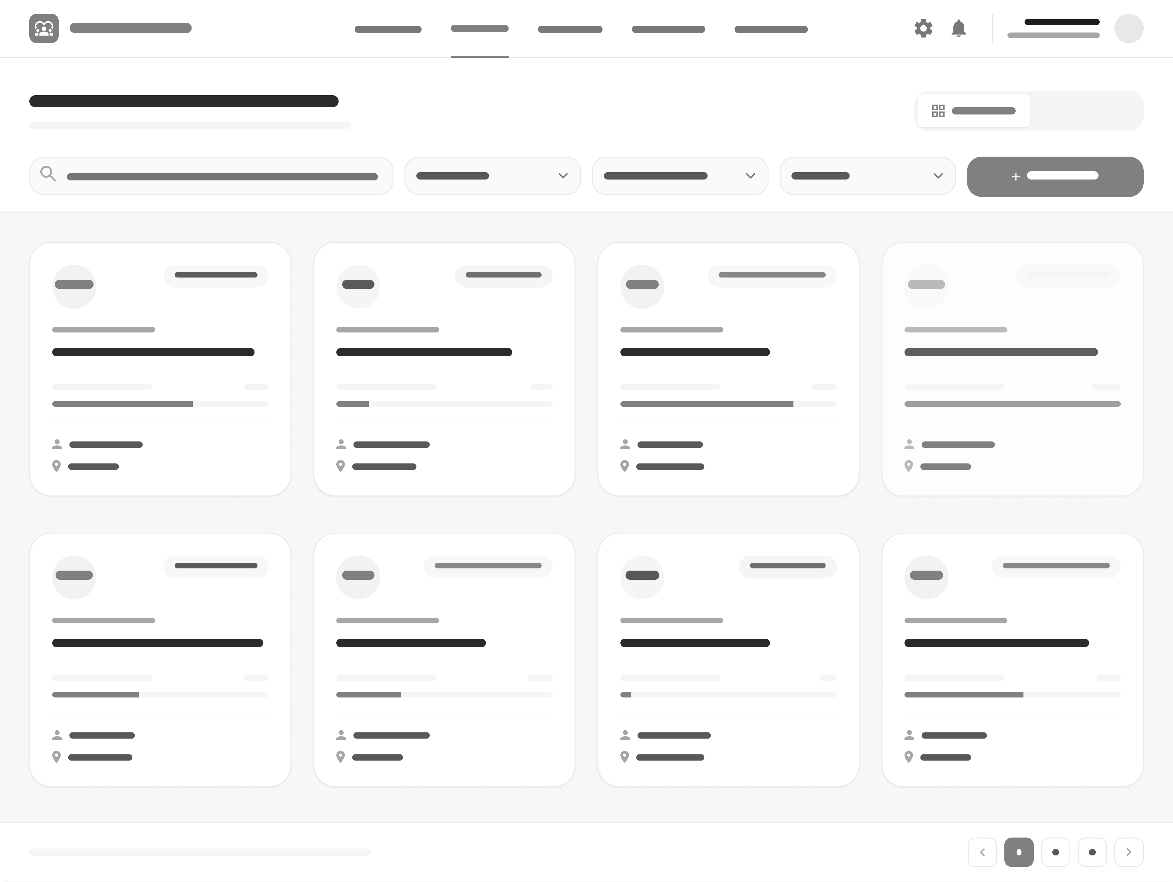
These wireframes tested the progressive-intake approach before visual design was added.
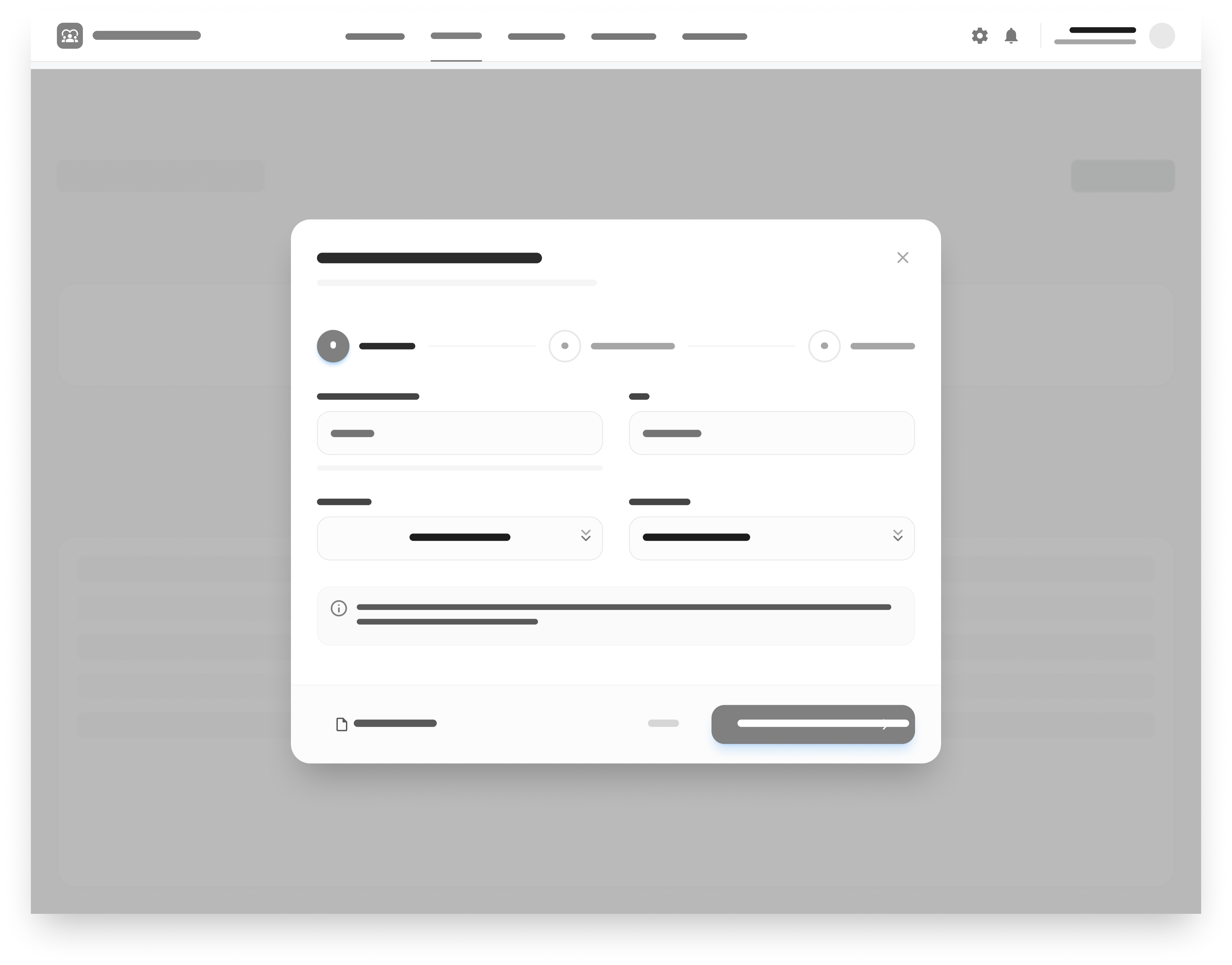
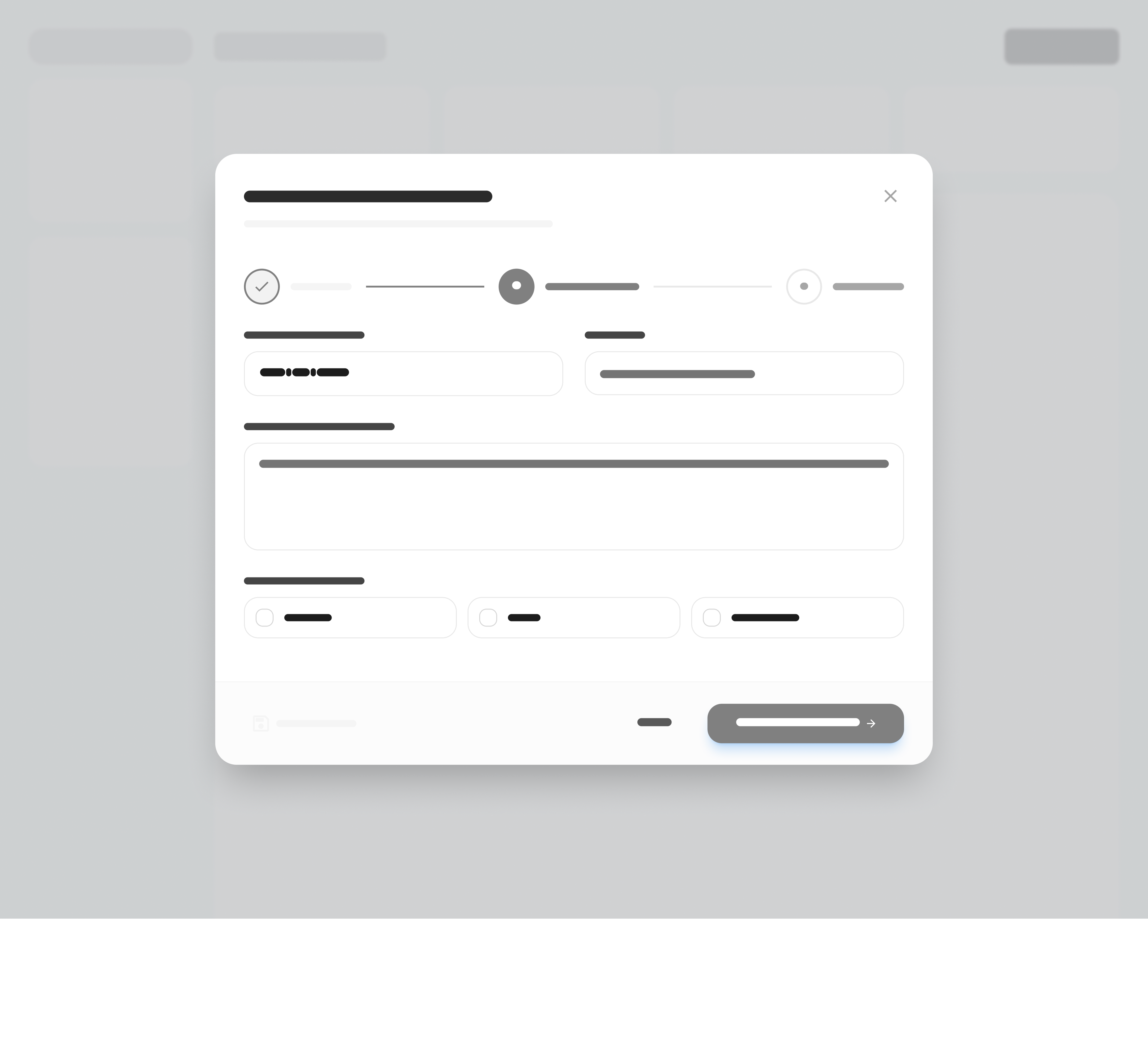
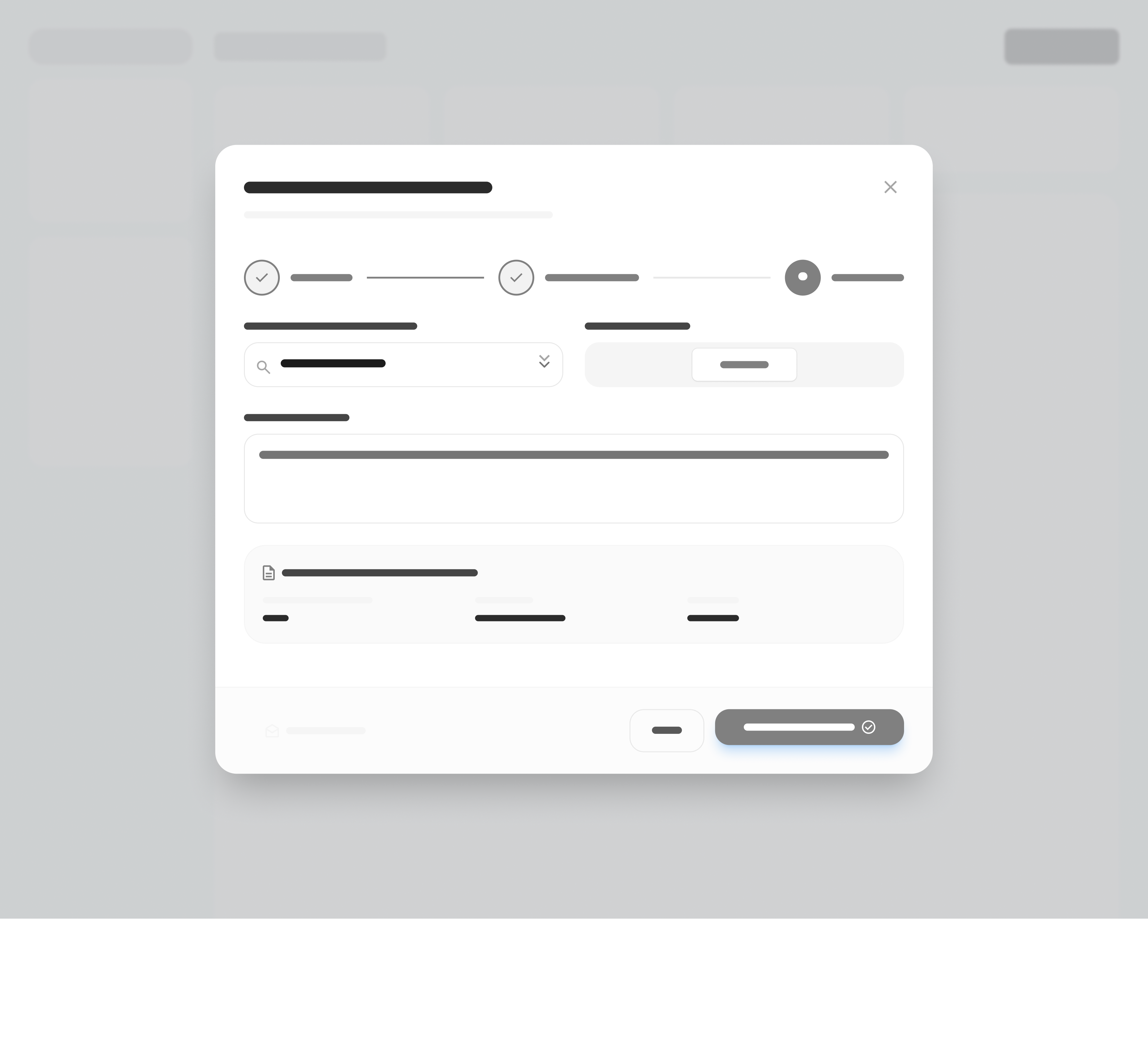
I mapped the key user flows to understand how caseworkers would move through the system to complete their most important tasks. These flows helped identify unnecessary steps, clarify the relationship between screens, and make sure the proposed workflow supported the way case information is captured and updated.


I built an interactive prototype with realistic content and components, covering three core tasks: creating a case, updating its status and moving it toward a report export.
The visual system favours legibility, predictable grouping and clear status cues. Status is never carried by colour alone; a label or icon backs up every colour cue.
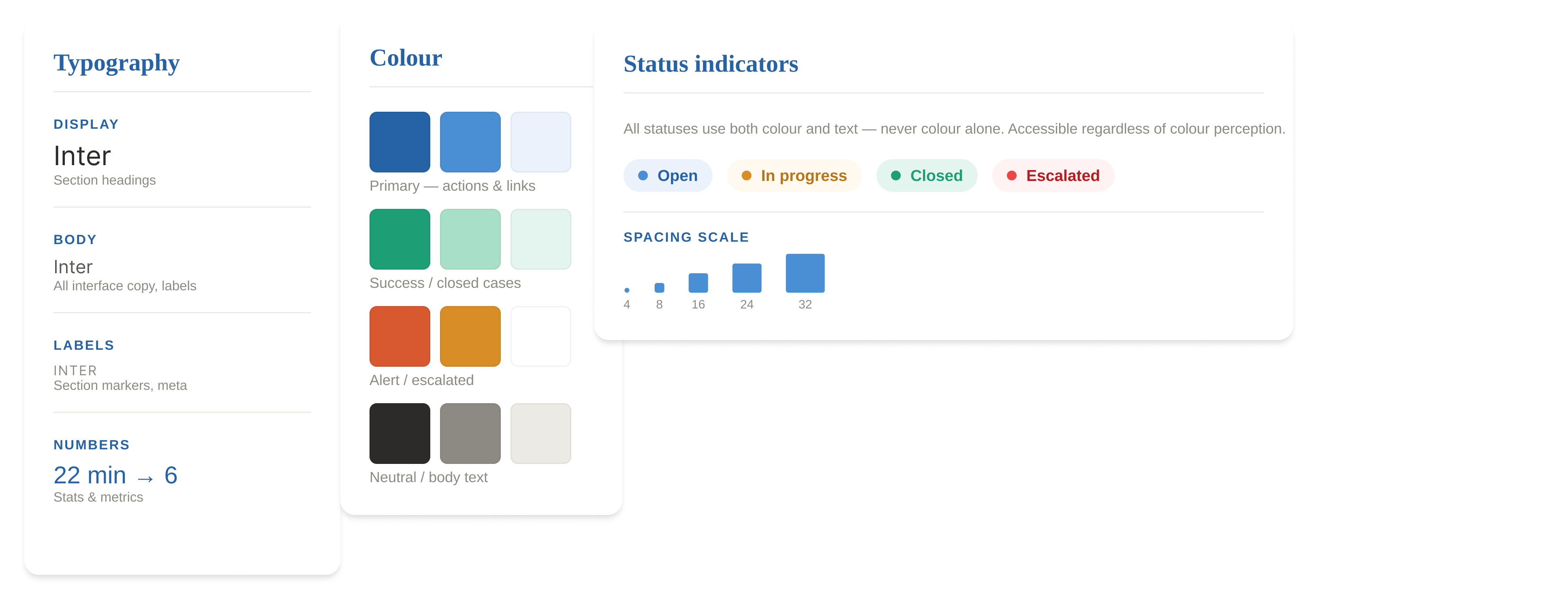
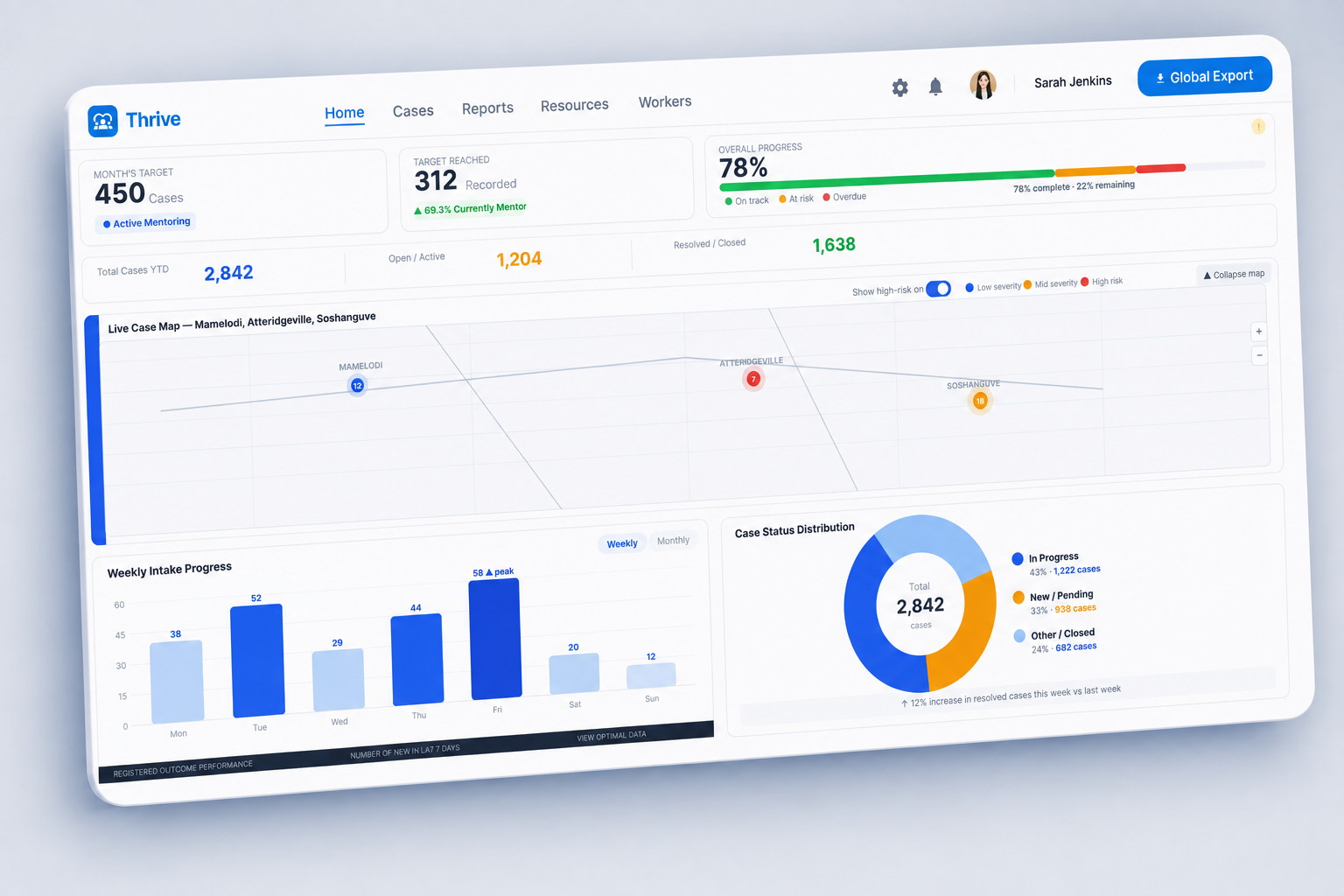
The design connects case visibility, intake, case detail and reporting around the decisions made through research and testing.
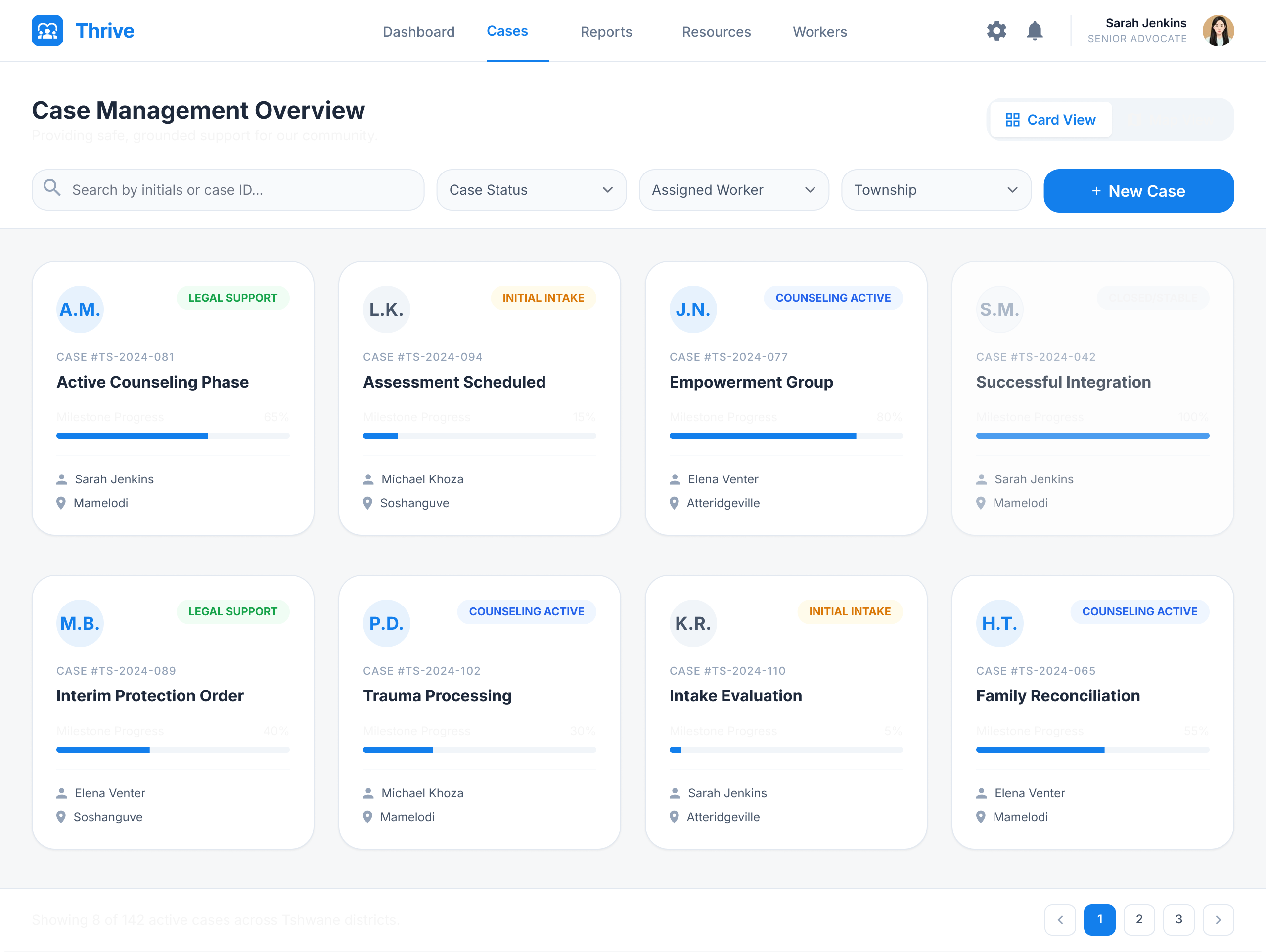
Coordinators see a high-level view of every case before they need to open a single record.
Risk and status cues sit apart from secondary detail, so the workspace can be scanned at speed.
Progressive disclosure keeps first contact simple while letting the record grow over time.
.png)
.png)
Five participants worked through the core case-management tasks in the prototype. I focused on task completion and comprehension rather than visual preference.
Users expected related case information to stay in one place, not spread across tabs.
Change → group related case information into one workspaceIt felt demanding when the required information simply wasn't available yet.
Change → use progressive disclosureUsers needed clearer confirmation once a repetitive administrative action was complete.
Change → strengthen confirmation and interaction statesThe biggest gains came from removing unnecessary decisions and reducing the amount of information required at first contact, rather than adding new functionality.
Intake completion time
How long it takes to create a case.
Case retrieval time
How quickly a worker can find an existing record.
Report preparation time
How much manual work still remains.
Task error rate
Where people still stumble or need help.
Designing for high-pressure work taught me that cutting complexity can be more valuable than adding features. The turning point came when I stopped treating the intake form as a record that had to be finished immediately, and started treating a case as information that grows over time.
Thrive is a speculative UX research and system design project exploring how digital case management could improve within the gender-based violence sector. The workflow changes, prototype outcomes and usability findings presented here come from the project's research and prototype testing. Thrive was not deployed in a live production environment, and the reported performance figures should not be interpreted as real-world organisational impact.